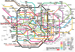
Information Architects Map the Internet

While it would certainly help to have been to Tokyo (Josh won’t stop raving about it), I don’t think it’s a prerequisite for understanding the Information Architects Web Trends Map 2007 Version 2.0. It’s got a long title, but it’s not that complicated. Basically, the Web Trends Map is a visual representation of the top 200 sites on the web, mapped out like the Tokyo Metro (which appears to be mind-numbingly Byzantine in nature. Here’s a link to the actual map for comparison). On the map, websites are connected by lines just like in a metro system, but in this case the lines are called “sharing,” “moneymaker,” and “news” instead of “red,” “1, 2, 3,” or “central.” This project may or may not increase your understanding of how the internet works, but it’s a cheeky idea nonetheless and something fun to look at. Also, PLEASE check out the clickable version, which makes following a line with your mouse more fun that it should ever be.
