Speartalks: The Little Friends of Printmaking

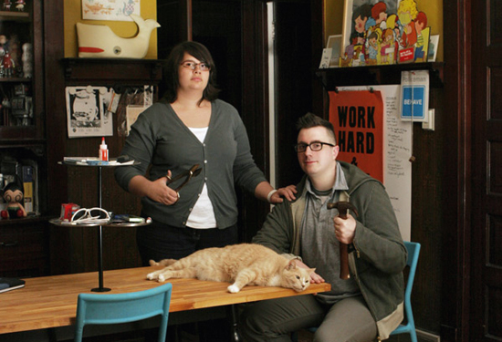
JW and Melissa Buchanan are the husband and wife team known as The Little Friends of Printmaking. Known for their God-like mastery of screen printing, their brightly layered imagery, and their quirky sense of humor (take that, douchebaggiezz!), this Milwaukee-based pair is cranking out posters and collecting high fives faster than you can say "zesty gazpacho."
Because we're big fans of concert posters (like any average league of flailing hipsters), we scored ourselves an interview with the arty couple, and wound up wondering if we were in the right profession. Read on to learn why these two ink slingers are living the dream.
Joshspear.com: Can you tell us about your personal backgrounds in printmaking?
Melissa: I've been making prints since I was a teenager "“ I started in high school; woodcuts and etchings, mostly. Because printmaking was my main jam, it only seemed natural to study art at the University of Wisconsin where they have a historically great printmaking program. I would talk them up more, but I'm holding out for an honorary masters degree.
JW: I don't have quite the background that Melissa does. I did some screen printing in high school. Screen printing was not something they taught as an art course. Instead, you had to go through a tunnel under the street to a completely different building out back by the auto shop, and then into a room that smelled like acetone and was filled with very dangerous-looking equipment. I enjoyed it but it didn't make a huge impression on me. I didn't make any more prints until I was in college. I had originally gone to the UW to study sculpture, but once I was there it seemed obvious to me that it was pointless to study anything else but printmaking at that place. I must've picked up a trick or two because I seem halfway decent now.
JS: It's awesome that the UW even offers a major in printmaking, because for some time "“ due to the computerization of the process and all the shortcuts it allowed – it seemed like printmaking could become a lost art. Are you into the history of your profession?
JW: Yes, we're very interested in the history of printmaking. Basically, all printmaking, to a degree, is historical anachronism. These are all processes that have become obsolete to some extent. For example, silkscreen is not the most efficient way to reproduce a drawing, but there are aspects of the process that produce really unusual and appealing results, so it is something that's worth preserving. As designers, we're always trying to push these unique aspects of what a screen print is, that essential “screen printness”, to the forefront. Otherwise, what's the point? If we're going to go to all of that trouble, then the end result should look like a fucking screen print. It should have underprinting, and weird color shifts, and you should be able to pick the layers apart.
M: As students, we were able to study all forms of printmaking and look deeply into the art history side of things. We're into it. We do use computers to design our stuff. We're not Luddites. We don't ride in a horse and buggy. But what's great about printmaking in general, and especially screen printing, is that it forces you to become more deliberate and thoughtful about your design choices. If your design stinks, you can't just tart it up with a bunch of lens flares and cheap effects.
JS: Do you ever fool around with letterpress printing, or are you screen printers to the core?
M: We've done some letterpress prints, some polymer plate stuff. We recently designed a few letterpress prints [for Poketo and Tiny Showcase] and that was a really fun experience. I wish it were something we could do more of, but I can't justify the expense and the hassle of owning equipment the size of a small car just to make two prints a year. At least, not another huge, expensive piece of equipment "“ you have to draw the line somewhere.
JW: I've fooled around with a pilot press, but I start to get a little nervous around chain-driven, motorized moving parts. You could really lose a finger in there. Mostly, I never did much letterpress because I don't write poetry and have no need for tiny books full of sad, secret words to myself. We briefly owned a few drawers of lead type and you couldn't show them to anyone without them dipping into the drawer and snagging a few letters for themselves. "Just my initials," they'd say. What is the point of having a whole drawer of 12 point Hobo if you don't have any W's, I ask you?

JS: You're famous for making some really funny posters. Irreverent stuff that makes people look and laugh. Is this something you consciously work towards, or is it just a natural extension of your style?
JW: We're desperate to be liked. The humor thing is a self-defense mechanism.
M: Probably because we're both nerds who wear glasses.
JW: Our feeling is that if they don't like the poster, at least they can laugh. And hopefully not at us, while pointing. We do appreciate that.
M: We just try to be true to ourselves in our work. We made a conscious decision a long time ago to let our work be an extension of our personalities, whether we're trying to be funny or whatever.
J: And our sense of humor can be a bit off, but we've kind of trained ourselves not to care about what the reaction will be. I'm mostly just trying to make Melissa laugh. She's not an easy laugh.
JS: Speaking of style, it's interesting when two artists collaborate to create one visual brand. It's really cool to watch couples meld this way. However, some people seem to get really stressed out over how two people can create one product. Do you deal with a lot of "Who does what?" questions?
JW: We get this all the time. We got it today, actually! It's hard for me to figure out where the motivation comes from. Part of me thinks they want to crack the code, and be the first person to get us to admit some shameful secret. What, I have no idea, but something. They're gonna get the big scoop. Headlines around the world: ONE OF THE LITTLE FRIENDS IS NOT AS GOOD AS THE OTHER ONE.
M: Little do they know that neither of us are any good.
JS: Your work is incredibly layered and pigmented, and it seems like there's so much room for error or over-saturation there, but you always pull it together perfectly. Is that a difficult process?
M: This is probably not the place for self-deprecation, but we never really think our stuff looks that good. We're always thinking about the ten things we were going to do if there was another workday, or the awful thing we were going to cut, or how we wish we were better at drawing. If it's screen printed, then we're picking apart the print job. We basically never get tired of hating on ourselves.
JW: I have no idea how to answer a question that is basically a compliment without coming off as a tit. Thanks?
JS: Do you love all of your characters as equally and unconditionally as the next, or do you have favorites?
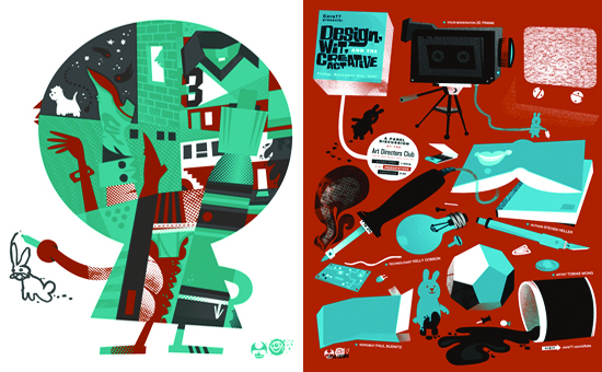
JW: Dingus Dog is my favorite because he's the physical manifestation of my self-loathing. He is so awful and repugnant, but so desperate, that it becomes slightly lovable. He's our unofficial mascot and we try to sneak him into things where he doesn't belong.
M: We always wanted to do another Dingus Dog comic, but we never got around to it. One where he's throwing a ball to himself because everyone hates him and won't play with him.
JW: Or later, he rolls under the bed and just hugs himself.
M: Saddest story ever told!
JS: What is the process of deciding on the imagery for each individual band poster? Are the posters symbolic, or more laid back?
JW: Some assignments call for a really strong concept, and some are completely open-ended. Honestly, we have a lot more fun with the tough ones, where the poster is supposed to be a jumping-off point for a whole identity or a set of merchandise. We like coming up with that kind of stuff, and we like the back-and-forth with the clients. I guess what makes it easier for us is that with a more complicated project, there's usually a point of reference that we can start building around.
M: Whereas your average concert poster is totally open-ended and usually not art directed at all. Terrifying.
JW: We have a fear of the blank page.
M: Ultimately, we try to make the posters appropriate to the subject matter without necessarily making an explicit reference, which feels like cheating. Also, we try to avoid visual puns, which are largely horrible.
JS: While you're working on a band poster, do you listen to their music?
M: We do try to listen to their new record all the way through a few times. Hopefully it shows.
JS: A band poster can be as historically relevant to a band as an album cover. It can reflect the emotional and cultural climate of the time the show occurred in, the state of the place that the show occurred in — everything, really. What do you hope that your posters reflect?
JW: It is nice sometimes — because our concert posters are by degrees less important or official-seeming to the band and their audience, we can use the poster to make commentary on some of that stuff. That wouldn't necessarily fly if we were doing an album cover or something that was more closely vetted. It frees us up to say whatever we want.

JS: You did a Laika toy! Are you working on, or hoping to work on, any more art toys?
JW: We've got some more platform toy projects in the works, and we're working on another toy from an original sculpt.
M: The toy thing is fun. In a way, it's related to what we do, because we're concerned with making multiples and editions and designing characters. But the whole process takes so long from beginning to end — it's crazy. We fell in love with silkscreen because of its immediacy.
JW: You get that rush of instant gratification.
M: But toy stuff can take years to come out. Everything's done overseas, and then they strap the crates to the back of a donkey and just give it a little spank in the direction of America. And then hopefully the donkey wanders into a toy shop.
JS: Who is on your current wish list of bands to do posters for?
M: Jay Reatard, Beach House, Panda Bear, Justice, The Knife, Volcano Suns, Glass Candy, M.I.A., Giorgio Moroder.
JW: This sounds awful, but I don't really listen to a lot of contemporary music. I wish I could do posters for all the weird old Italo 12-inches that I get fixated on. If that made sense at all, that's what I'd be doing.
JS: Are you working on anything new, challenging, or exciting?
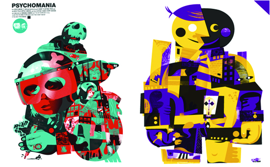
JW: We've started working on our latest series of BAD VIBES art prints, which will be coming out through spring and summer of this year. We're on series three now. It's a way for us to expand what we do as artists and designers "“ new themes, new ideas, new ways of drawing. It's something we look forward to doing every year.
M: The art print series started out as just an experiment, but the response was big enough that it sort of created its own momentum. It's a simple concept: they're poster-sized art prints with that same sort of aesthetic, made in a large enough edition that we can sell them for the same price as a poster. It was one of those "duh" moments where we were like, "Why doesn't everybody do this?" And now, happily, a lot of our peers are making affordable art print series, too. It's great, because you shouldn't have to pay a premium for art.
JW: We've got some gallery shows coming up this year in Mexico City, Chicago, and here in Milwaukee. Those should be pretty fun.
M: I would talk more about what's coming up but I don't want to make any promises we can't keep. I don't want people to come up to me and be like "Hey, when is XYZ coming out?" and I'm like "uh"¦ that fell through. We stink."
