Sam Potts & The Sport of Design
![]()
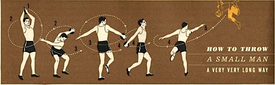
Each year, designers and fans anxiously await the start of the Layer Tennis season. 2009 was no different, as Coudal Partners, a Chicago ad and design agency, kicked off a series of live online design events in which professionals trade designs back and forth in real-time, building on top of their opponent’s work. A third party offers commentary which is often whimsical as well as inspiring and unpredictable. The audience can comment during the actual match as well as vote for a winner afterward, all using Twitter. This current season started on February 3 and was held every Friday ending May 29. We are currently in the playoffs in which you can find our featured designer, Sam Potts facing off against Aaron Draplin this Friday, June 12.
In this second season (of its current incarnation), we wanted to get an idea of the impact Layer Tennis has on the participants and the design community at large. Could we find a pattern in the tools or techniques used? What sort of pressures do they face when the ball in in their court and the clock is ticking? Keep reading for the interview…
JoshSpear.com: When did you first get into design, and what got you started?
Sam Potts: In 1995 I was hired as the assistant to the design department at Simon & Schuster. This was my first design job, my first exposure to typography, layout and printing, and my first time working with material written by other people. Before this, I’d made zines in the traditional way, with scissors, white out, rubber cement and photocopiers. The zines I made were to me primarily writing projects, though. Making a physical thing was a secondary aspect, but over the years I found I really enjoyed the assembly part: folding, stapling and making inserts. All this was in the early 90s, when SyQuest roamed the earth. So I went from zines to books to general graphic design.
JS: What inspires you and how does this come through in your work?
SP: Old things, language, anti-magnetism. I spend a lot of energy trying not to do certain things, the obvious things — crop something huge, Mrs. Eaves font, lots of pink, grids. I file away as much as I can, let it get moldy, spill some soup on it, and then copy that thing rather than the original. It’s less obvious when you steal from your memory of something than when you steal the very thing itself. So what comes through in my work, maybe, is that whiff of some old thing and not really fresh.
JS: Can you speak a little bit about the impact Layer Tennis has on the design community? How does it resonate? How do you get selected to participate?
SP: Layer Tennis has a lot of impact. It’s great to cheer and comment on the match as it’s happening — this feels much more “live” than a blog discussion that can take days. And Layer Tennis is really one of the very few things out there that’s created entirely around having fun designing. Unlike design blogs or image blogs, LT is actually designers designing. So a big part of the appeal is that it’s a chance to see design actually happening right in front of you. It’s like an action movie.
I don’t know how a person gets selected — it could be a ritual, a roulette kind of situation, or a secret logarithm. In my case, I think my opponent Armin Vit suggested me to Jim Coudal since Armin and I were both living in Brooklyn at the time and that made for an interborough match-up. Also, I owed Armin $12 and this was his way of taking it out of my hide.
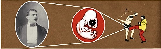
JS: How important is for you to preserve an element of your opponent's volley and build on top of it. Or do you like to create new items altogether, while maintaining the theme of the match? For example, in volley #2, you kept the wrestling motif but changing it from modern day Mexico to ancient Greece. The style (“printed” on textured cardstock) also was preserved but of course slightly changed. Then, in volley #4, you changed things up entirely.
SP: Layer 4 was my hardest layer. That was where I was sure I’d been totally gutted and was looking at 6 more layers of being stomped on. I thank you for crediting me with changing things up on purpose, but in truth I was dying.
Layer Tennis decorum requires each player to carry something over from the previous volley. There are some rules to be observed, and building on top of your opponent’s volley is the cardinal rule.
Armin and I did not set up a theme beforehand, and I think mostly it’s the person who serves who can set a tone if there is to be one. In my match, the time pressure was so great that I couldn’t keep sight of the theme — there was sweat in my eyes and my hands were shaking. The best you can hope to do is come up with something that will look like it’s supposed to make sense, or it might make sense.
JS: What tools did you use in your designs? Were there any specific features that helped save time? What filters or techniques were used?
SP: Armin made creative and editorial use of the Photoshop filters in layer 7, and I given him credit for totally derailing my previous layer. Every layer is like getting raided by pirates and Armin stole all my booty with that one.
I am a big fan of the Clone Stamp and Eraser Tool in Photoshop. I’m a simple man and I like simple tools. I used the Clone Stamp in my fourth layer, and did the final assembly in Illustrator. Layer 8 was all done in Illustrator. Everything else was Photoshop.
Legal Jargon: Layer Tennis is a production of Coudal Partners in Chicago and is presented by Adobe® Creative Suite® 4 Shortcut To Brilliant.