Nexus One Hands On Review

By now you’re probably inundated by news of the Nexus One, an HTC built phone that many dubbed the Google Phone. The Mountain View company stayed true to their word and while they did not manufacture the phone, it is clear they had a heavy hand in its design. The phone is the only one current running the latest and greatest (2.1) Android build and boasts an impressive hardware suite: 1Ghz Snapdragon processor, 11.5mm thick, 5MP camera with LED flash, 3.7-inch WVGA AMOLED display, 802.11 a/b/g/n, Bluetooth, 512MB RAM, 512MB ROM, 4GB microSD in-box expandable to 32GB.
Many people were looking at this phone as being a game changer, an iPhone destroyer, even after they looked at the specs and saw the leaked videos and images. In the past 10 or so years there have only been two really important phones – the Motorola RAZR and the iPhone became king (2007). I feel like Google never set out to destroy the iPhone overnight. After all, in order to do so, a phone would have to be as revolutionary as the iPhone was three years ago. Clearly this is not the case. With the Nexus One, Google is trying to disrupt the market by giving users more options.
Note: My review will be of the phone as a standalone unit. For clarification, my last phone was an iPhone 3G and I don’t have experience with the Droid. I may make some comparisons but, for example, when I say the phone has good call quality, I am not saying the iPhone does not.

Hardware
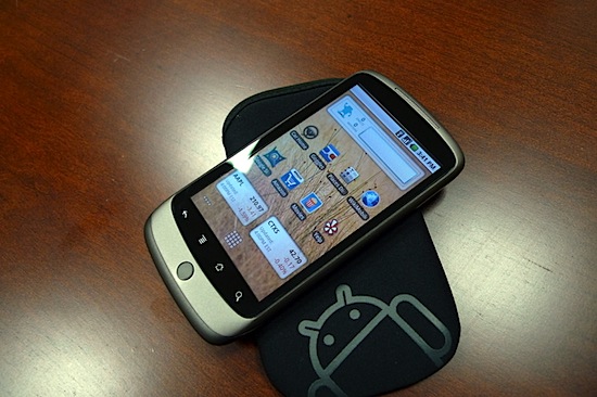
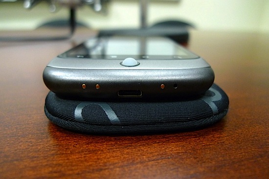
The phone is both thinner and lighter than the iPhone but not by any meaningful amount. The corners are curved and smooth, unlike the sharp corners of the Droid and the back has a type of smooth plastic that is matte instead of shiny and slick like the iPhone. It is slightly grippy and resists fingerprints quite well. The front has four “buttons” which are actually just touch sensitive areas of the display linked to back, menu, home, and search. Each of these buttons also have alternative commands if you press-hold them. There’s also a trackball/button on the center bottom. There is absolutely no application or part of the OS that requires the use of the trackball though it is fully supported. One really good use of the trackball is to place the cursor on a specific location in the middle of a long string (think URL with an argument), something I found impossible to do with the iPhone’s press-hold zoom cursor. Also, the trackball glows in slow, spaced-out intervals as a visual notification. The bottom has 3 contacts (for docks and possibly future accessories) and a micro USB for mounting the device as a data drive. Remember, the point of Android is to avoid desktop sync tools. Everything is done over the cloud. The only reason you’d connect up to a computer is to transfer files. I am glad they are using a micro USB rather than a proprietary connector. The phone feels good in the hand and comfortable against your face when talking.
The 5MP camera has both autofocus and an LED flash. I have never been impressed by a cell phone’s picture quality and this is no different. It’s an OK camera and the flash often blows out the center with a gradual reduction in brightness as you move away from the center of the frame. This is not unlike other cameras with flash but still an annoyance. I found the picture quality to be good but not great. I still carry a real digital camera if I want to get good shots.
The noise cancellation is particularly helpful but it’s really a subjective measurement. I found my call quality to be better than the iPhone but maybe my phone calls have recently been in different environments. I have tested it in some noisy situations and it fared well but I didn’t have an iPhone with me to do an A/B test.
Battery life for me started out pretty bad. I was getting about 12 hours of usage before it got dangerously low. However, by disabling live wallpapers and perhaps as a result of a few weeks of charge cycles, I am getting about 15 hours now before the battery reaches 20%.

Software
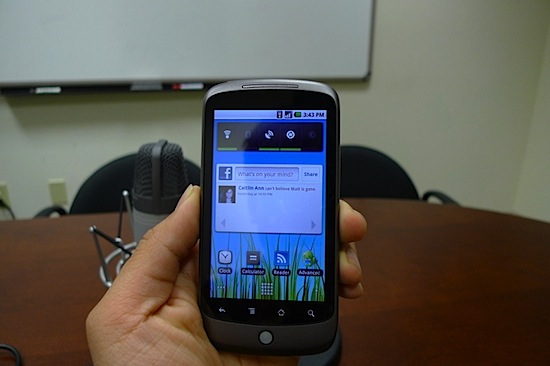
Where the Nexus One really shines is the operating system and user experience. It has complete integration with the Google cloud, and in fact can support multiple Google accounts, giving you the ability to sync your contacts, mail, and calendar or some combination of the three. It also integrates with Facebook and Google Voice. What I really like is the single point of contact feature. On the iPhone if I wanted to send someone a Facebook message, there’s an app for that. Then if I wanted to look up their address, I’d have to find them in contacts. With the Nexus One, John Doe has a single contact and from it I can call him (via phone or GV), text (again, phone or GV), launch his Faceobok profile, navigate to his address, etc. If you don’t have photos for your contacts, it’ll automatically grab it from their Facebook profile and if your friends entered, for example, a work address in Facebook that they never gave you, it’ll show up too.
I spoke about the Google Voice integration but it bears repeating. You can setup your phone to make all outgoing calls using Voice or if you wanted it could use it only on international calls or prompt you each time. GV gives you free text messaging, voicemail transcription and archiving and the application works beautifully. Unfortunately, at this time, there is no push for GV so there may be up to a 5 minute delay for SMS though there’s an easy workaround for that – simply have GV email you.
My email experience on the Nexus One is substantially better than the iPhone. First off, there is no native Gmail push on the iPhone. You can setup a sync scenario using Exchange but the iPhone only supports one Exchange server so those of us with jobs will have to decide between syncing work or play. On the Nexus One, you can have multiple Gmail accounts and Exchange and they are all push. The Gmail application mimics the website quite well, offering all major functionality. One thing I did not like is there is no calendar syncing for Exchange. Hopefully this gets added at a later date.
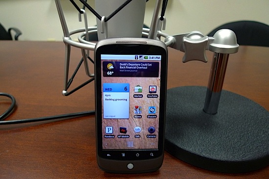
Applications on the Nexus One are not limited by 1×1 icons and if installed, they are not required to be displayed on one of the home screens. On the iPhone if you have an app, it must take up real estate on a screen. The Nexus One has an applications icon which loads up all your apps and allows you to quickly scroll through them vertically, in a 3D cube like system. Of course, if there’s anything you use frequently, you can place it on one of the five home screens. In addition, there are modules, folders, and shortcuts that can be placed on the screens and they can be any shape. You can have a weather module that is 2 rows by 2 columns or one that shows you Facebook updates that’s 4×2. The shortcuts and folders are really interesting. For example, you can set a navigation shortcut (icon) that automatically routes your current location to your house. Or you can setup a folder that shows your Pandora stations.
Android supports background applications, which when coming from an iPhone, is such a godsend. I don’t think I realized what I was missing or how annoyed I was until I experienced multitasking on the Nexus One. Apps also have access to the notification area on the top which keeps track of events for you. Notifications are not a focus grabbing pop-up and are quite unobtrusive. For example, when I get new mail, there’s a tiny Gmail icon that appears on top. Each application has settings which allow you to tweak or completely disable notifications, if you please.
In addition to Google Voice, both search and text fields support voice as well. You can use speech-to-text in any text field including SMS and email, and you can use voice commands such as “Call Josh.” I’ve had problems with these features, however, since it has to send your data to the Google servers. If you happen to be using a slow data connection or there’s an issue with you route, you’ll get an error. Also, since no training is involved, the results are not always 100% correct, but they have always been pretty spot on. As a phone, the Nexus One works well. In the last few months, I’ve dropped half of my calls on the iPhone. I also was experiencing a phenomenon where the OS would actually crash if I received a call while using an application, thus preventing me from ever answering. I have had no such issues with the Nexus One and in case you are curious, I am using EDGE on AT&T right now.

Complaints
The Nexus One is a wonderful phone but not without flaws. Some programs force quit (crash) on startup and I have had the phone freeze twice and it was quite frustrating (and scary) to get it to restart. There is never lag from the processor when starting applications but flipping quickly between home screens sometimes showed some hesitation. Some web pages were slow to load (but not anything like what Engadget’s “demo” showed). And before I forget, there is no multitouch. The hardware and software support it but I guess Google doesn’t feel like violating patents. Personally, as a former iPhone user, I found myself missing multitouch for about 3 days then I got over it. It’s really not a big deal. You can still double tap to fit to screen when reading articles and I have not had any issues with the keyboard. In fact, I am typing quite fast now using a beta version of Swype (which further points to the open nature of Android). My last concern is Android has about one-fifth the apps as the iPhone and even when there are two versions for the same application, the iPhone one is usually better. In my Google News feed today, I came across at least three new apps announced that would be exclusive to iPhone. That kind of stings. But so far, I have not found myself really missing any functionality due to a lack of apps. I do wish the Facebook app would improve and Mint would deliver an app soon, though.
Conclusion
What do I think of the Nexus One? I clearly like it and find it to be a better phone than the iPhone (which I sold a few days after receiving the Google phone). However, I don’t think it’s significantly better or the type of game-changer that many critics were unfairly claiming it should be. If you were ready to sign a new contract and were deciding on a phone, it’d be between the iPhone and Nexus One (or Droid). Before this quarter, there was only one choice. In a year’s time the Android OS has come from the abysmal G1 to I consider a worthy adversary to the iPhone and it’s exciting to know it can only get better.
