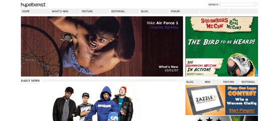
Hypebeast Looks Good

Ladies and gentlemen, it is a crazy world. As we speak, two men in a small town in South Carolina are fighting over an amputated leg, three nuns in Italy are recovering from a catfight, and people are buying tickets to the Spice Girls reunion tour. In other words, high fives go out to Hypebeast for their simplicity, coming to you in the form of a mellow site redesign. They could have borrowed from the sneaker colorways that they go crazy over; they could have hyped their name by making their logo take up half of the page; they could have made it about them, and not the stuff they write about They could have done a lot of things, but instead they did gray, black, blue, and a teeny little bit of self-promo in the top left corner. And it’s pretty nice. So, even though they didn’t put Mother Superior in the hospital, I still think they deserve to be in the news. From one blog to another, nice job guys (and 101 Media Lab, the Japanese company behind the redesign).
